
To download the IUL UPDATED ROR probability chart, click on the following link:
https://advisorshare.com/iul-probability-of-return
I first issued this report in 2021. Since then, the S&P 500 has had the following returns:
-18.16% in 2022
+26.18% in 2023
I thought it was time to update the report to see what the NEW 25-year rolling average rate of return would have been in an IUL depending on the cap rate. Hint, the numbers got better.
What’s the realistic rate of return that can be expected from the policy?
This is the #1 question clients ask when evaluating an IUL as a wealth-building tool. Most advisors don’t know how to answer this vital question. This probably of return chart should help!
If an IUL has a 12%, 11%, 10%, 9%, or 8% S&P 500 annual point-to-point cap, what is the probability that the product would have generated a return of 5%-7+% over the last 25 years?
Here’s a glimpse at the numbers:
9% cap had a 15% chance of generating a 6% rate of return over the last 25 years.
10% cap had a 27% chance of generating a 6% rate of return over the last 25 years.
11% cap had a 62% chance of generating a 6% rate of return over the last 25 years.
12% cap had a 77% chance of generating a 6% rate of return over the last 25 years.
The following is what the chart looks like without the actual numbers.
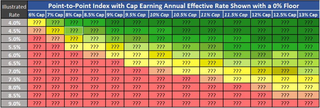
Why is this chart so important? It will help advisors set the long-term expectations of what the IUL should return over time at a “realistic” number. My opinion…just because the default crediting rate is 6.5% doesn’t mean you should be illustrating at 6.5%.
FYI, only TWO companies on our top 18 IUL list have S&P 500 caps at 12.00% or higher.

The only Retirement Planning Software that uploads and illustrates an IUL for retirement cash flow.
If you are using the following programs, it’s time to make the switch to OnPointe!
Retirement Analyzer; E-Money; MoneyGuide Pro; Retire Up; Other
You will be blown away by the capabilities of OnPointe Retirement Planner!
To watch a DEMO of how the software works, click on the following link:
https://advisorshare.com/onpointe-retirement-planner
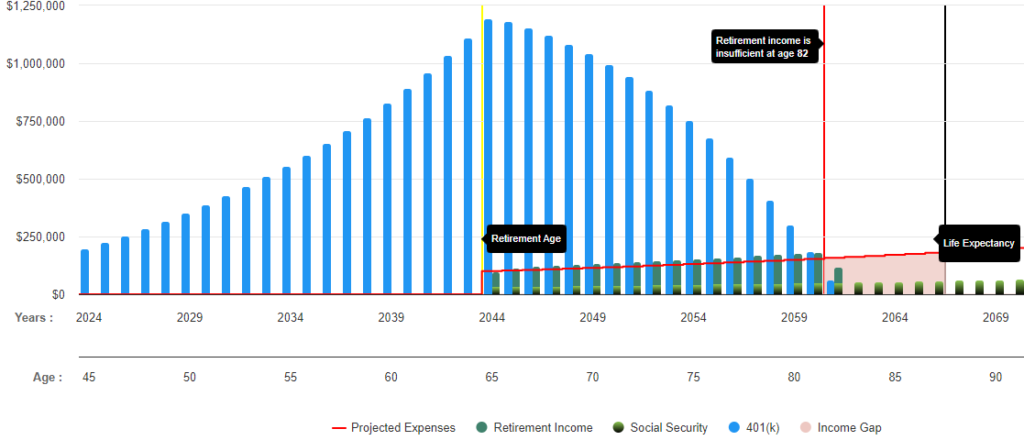
The charts and interactive nature of the program are awesome! Show a client their Retirement Income Gap using a tax-deferred 401(k):
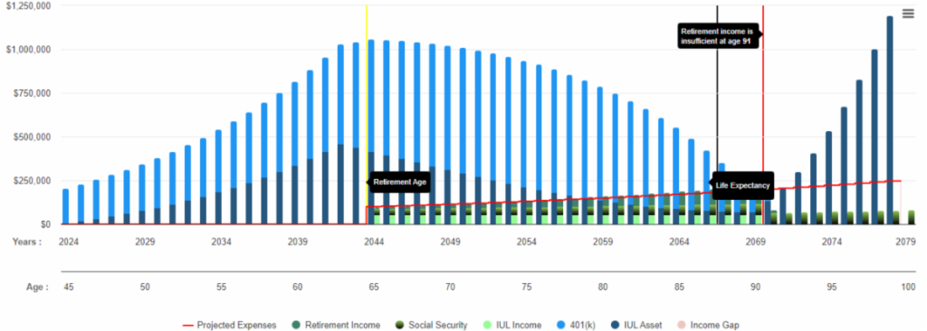
Then show what happens when you stop funding the 401(k) and start funding an IUL. You FILL IN the retirement income gap. There is no better illustrative software in the industry.
Again, if you are using programs like Retirement Analyzer and others, it’s time for you to upgrade your tech stack with OnPointe.